What is visual hierarchy in design and why does it matter?
Every successful design has one thing in common — it guides your attention effortlessly.
Whether you’re scrolling through a website, looking at a billboard, browsing social media, or opening a mobile app, your eyes naturally follow a certain path. The way designers control that path is called visual hierarchy.
Visual hierarchy is one of the most important principles in graphic design, UI/UX, branding, and web design because it determines how users consume information and interact with a visual experience.
Without it, even the most visually appealing design can feel confusing, cluttered, or ineffective.
What Is Visual Hierarchy?
Visual hierarchy is the arrangement of design elements according to their importance.
In simple terms, it tells users:
- what to look at first,
- what to notice second,
- and what actions they should take next.
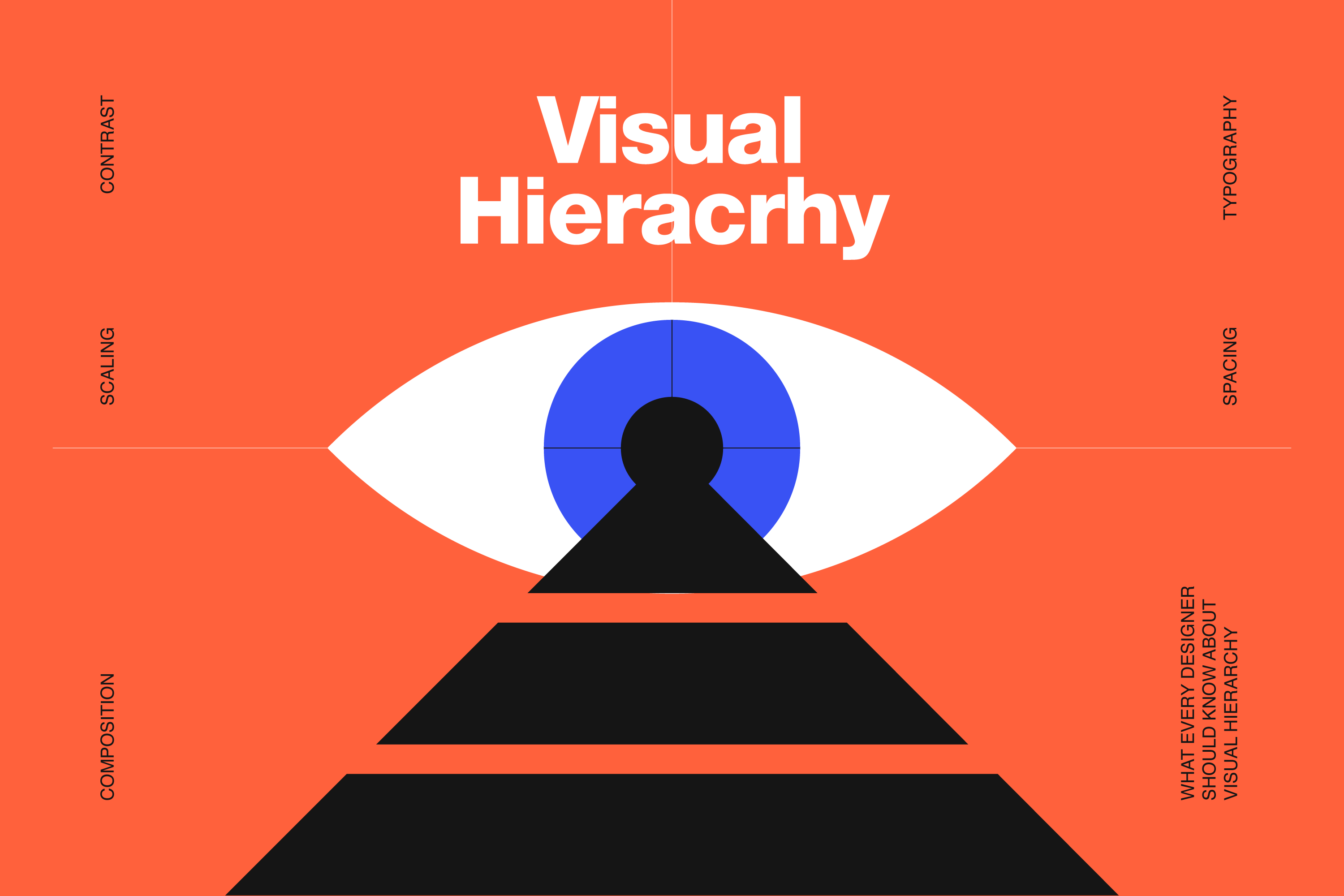
Designers use different visual tools like size, contrast, typography, spacing, alignment, color, and composition to create a clear flow of information.
A strong visual hierarchy makes content easier to scan, understand, and remember.
Why Visual Hierarchy Is Important
People don’t read designs — they scan them.
Studies in web usability and user behavior show that users make decisions within seconds. If your design doesn’t immediately communicate the right message, attention is lost almost instantly.
Good visual hierarchy helps:
- improve readability,
- increase engagement,
- guide users toward CTA buttons,
- highlight important information,
- create a more professional appearance,
- and improve overall user experience.
Whether it’s a landing page, packaging design, presentation, or social media ad, hierarchy directly affects how effective the design will be.
The Main Principles of Visual Hierarchy
1. Size and Scale
Larger elements naturally attract more attention.
This is why headlines are bigger than body text and CTA buttons are larger than secondary links. Size helps users instantly understand what matters most.
If everything on the page is large and bold, nothing stands out. The key is creating contrast between primary, secondary, and supporting elements.
2. Color and Contrast
Color is one of the fastest ways to direct attention.
Bright colors, high contrast, and accent elements immediately pull the eye toward important content. Designers often use contrast to emphasize buttons, headlines, promotions, or key messages.
Low contrast, on the other hand, can make designs difficult to read and visually flat.
3. Typography Hierarchy
Typography plays a huge role in content organization.
Different font sizes, weights, and styles help users quickly distinguish titles, subtitles, sections, and body content. A clear typographic hierarchy improves readability and creates structure within the design.
One of the most common mistakes is using too many font styles or making all text appear visually equal.
4. Spacing and White Space
White space is not empty space — it’s a design tool.
Strategic spacing gives elements room to breathe and helps users process information more easily.
Good spacing improves clarity, focus, balance, and overall aesthetics. Crowded layouts usually feel overwhelming and unprofessional, even when the content itself is strong.
5. Alignment and Layout
Alignment creates order.
When elements are aligned consistently, the design feels cleaner and easier to navigate. Proper layout structure also helps establish visual rhythm and guides the eye naturally through the composition.
Many successful websites and interfaces use grid systems specifically to maintain strong visual hierarchy.
Common Visual Hierarchy Patterns
F-Pattern
The F-pattern is commonly used in text-heavy layouts like blogs and websites.
Users typically scan horizontally across the top, move slightly downward, then continue scanning vertically along the left side. This is why important headlines and key information are often placed at the top left of a page.
Z-Pattern
The Z-pattern is more common in visual layouts with less text.
Users visually move from top left, to top right, diagonally downward, and finally across the bottom. This pattern is often used in landing pages, advertisements, presentations, and hero sections.
Examples of Visual Hierarchy in Real Design
Visual hierarchy appears everywhere: websites, mobile apps, packaging, posters, presentations, branding systems, and social media graphics.
For example:
- Netflix emphasizes thumbnails and titles through scale and contrast.
- Apple uses massive white space and typography hierarchy for product focus.
- Spotify highlights album art and CTA buttons using color contrast and composition.
Great design rarely happens by accident — hierarchy is carefully planned.
Common Mistakes Designers Make
Some of the most common hierarchy problems include: too many focal points, inconsistent typography, poor spacing, weak contrast, overusing colors, and cluttered layouts.
When every element competes for attention equally, users don’t know where to focus. Strong design is often about reducing noise, not adding more elements.
Final Thoughts
Visual hierarchy is what transforms a design from “good looking” into effective communication. It helps users navigate information naturally, improves usability, and creates a smoother visual experience across digital and print platforms.
No matter the industry or medium, understanding visual hierarchy is essential for creating designs that not only look professional — but actually perform. At the end of the day, design is not just about aesthetics. It’s about guiding attention with intention.