Why every brand needs a clear visual system
A logo is not a brand.
Neither is a color palette, a typeface, or a beautiful website.
A strong brand is a system — a recognizable combination of visual and verbal elements that work together consistently across every touchpoint. A brand style guide is what helps that system stay consistent as the business grows.
Whether you are launching a new company, refreshing an existing identity, or working with multiple designers and marketing teams, a clear brand style guide gives everyone the same visual direction.
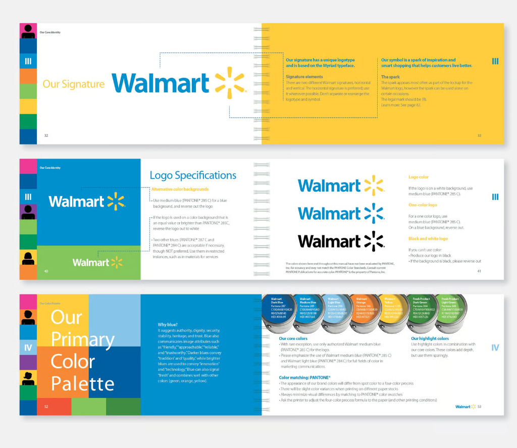
What Is a Brand Style Guide?
A brand style guide is a practical document that explains how a brand should look and communicate.
It defines the rules behind the visual identity — from the correct use of the logo and colors to typography, imagery, layouts, and other graphic elements.
In larger brand systems, it can also include tone of voice, messaging principles, digital guidelines, motion, and examples of the brand in real-world applications.
The goal is simple:
Anyone working with the brand should be able to understand how to use it without having to guess.
A good style guide doesn't limit creativity. It creates a framework within which creativity can remain consistent.
Why Does a Brand Style Guide Matter?
As a company grows, more people start creating things for the brand.
- A designer creates social media graphics.
- A developer builds a website.
- A marketing team prepares an advertising campaign.
- A printer produces packaging.
- An external agency creates a presentation.
Without clear guidelines, everyone can interpret the brand slightly differently.
The logo might be used in different proportions. Colors can slowly change from one application to another. Different fonts start appearing across materials. Photography develops different styles. Eventually, the brand that was originally designed as one coherent identity starts looking like several different brands.
A style guide helps prevent that.
Consistency builds recognition
People recognize brands through repeated visual and verbal cues. When the same logo, typography, colors, imagery and design principles appear consistently, the brand becomes easier to recognize and remember.
It saves time
A good style guide eliminates many small decisions. Instead of asking: "Which font should we use?", "Can we put the logo here?", "Which version of the logo should go on a dark background?", or "Can we use this color for the button?", the team can simply refer to the established system.
It makes collaboration easier
Brand identity is rarely handled by one person forever. A company may work with several designers, developers, agencies, printers, photographers and marketing specialists. A clear guide gives everyone a common reference point.
What Should a Brand Style Guide Include?
There is no universal number of pages a brand guide should have. For some businesses, a concise 10–15 page document is enough. For a large organization with multiple products, markets and teams, the guidelines can become much more extensive.
The important thing is not the number of pages. It's whether the guide contains the information people actually need.
1. Logo Guidelines
The logo is usually the first section of a brand style guide. It should explain which logo versions are available and when they should be used.
Typical elements include:
- Primary logo
- Secondary or alternative logo
- Symbol or icon
- Horizontal and vertical versions
- Black and white versions
- Clear space
- Minimum size
- Background usage
- Examples of incorrect usage
Showing what not to do is particularly important. Stretching the logo, changing its colors, adding effects, rotating it or placing it on an unsuitable background can quickly damage a carefully designed identity.
2. Color Palette
Colors should be defined precisely. A professional brand guide normally includes the primary and secondary colors together with their relevant digital and print values, such as HEX, RGB and CMYK.
But simply listing colors isn't enough. A useful guide should also explain how they work together.
Which color is dominant? Which color is used for accents? Which colors should be used for backgrounds? Which combinations should be avoided?
The difference between a collection of colors and a real color system is hierarchy.
3. Typography
Typography is one of the most important parts of visual identity. A brand style guide should establish which typefaces are used and how they are used.
This can include:
- Primary typeface
- Secondary typeface
- Headline styles
- Body text
- Font weights
- Font sizes
- Line heights
- Letter spacing
- Digital and print usage
- Fallback fonts
The objective isn't simply to say "Use this font." It is to create a recognizable typographic hierarchy that works across different applications.
4. Photography and Imagery
Photography can completely change how a brand feels. Two companies can use exactly the same logo and colors but feel completely different because their photography styles are different.
A brand guide can define things such as photography style, lighting, composition, subject matter, color treatment, image cropping, illustration style, and image filters or effects.
5. Graphic Elements
Many identities include more than just a logo. Patterns, shapes, icons, textures, lines, illustrations and other graphic elements can become important parts of the visual language.
6. Layout and Composition
This is an area that is often overlooked. Guidelines can establish principles for spacing, alignment, grid systems, margins, content hierarchy, image-to-text relationships, composition, and use of whitespace.
7. Voice and Tone
A brand doesn't only communicate visually. It also has a voice. A more comprehensive brand guide can define how the company communicates with its audience — whether the tone should be professional, friendly, technical, playful, direct or something else.
A Brand Guide Should Show, Not Just Tell
One of the biggest mistakes in brand guidelines is creating a document full of rules but very few examples. People understand visual systems much faster when they can see them in context.
Instead of simply saying: "Maintain sufficient clear space around the logo." show an example.
Instead of saying: "Use the primary color for important actions." show how that looks on a website.
A good brand style guide should behave almost like a visual toolkit. Show the system in action.
Brand Style Guide vs. Brand Guidelines
The terms brand style guide, brand guidelines and brand book are often used interchangeably. There can be a difference in scope, though.
A style guide often focuses primarily on the visual identity — logo, colors, typography, imagery and design rules.
Brand guidelines can be broader and include the brand's positioning, personality, messaging, voice and strategic foundations.
A brand book can go even further, combining the brand story and strategy with the complete visual system.
How Detailed Should Your Brand Style Guide Be?
Not every company needs a 100-page brand manual. In fact, making guidelines unnecessarily complicated can make them less useful.
The key question is: Can someone who wasn't involved in creating the identity use the guide and produce something that still feels like the same brand? If the answer is yes, the guide is doing its job.
A Brand Style Guide Is a Living System
A brand isn't frozen on the day the logo is delivered. Companies launch new products. Websites evolve. Social platforms change. New campaigns appear. Teams grow. Your brand guidelines should be able to evolve with the business.
Final Thoughts
A strong visual identity gives a brand a recognizable face. A strong brand style guide makes sure that face stays recognizable wherever the brand appears.
At Brandbusters, we approach brand identity as a complete visual system — from the initial logo and identity concept to typography, color, digital applications, websites and the guidelines that bring everything together.
If you're building a new brand or your existing identity has started to feel inconsistent, a clear brand style guide can be the difference between having a collection of design assets and having a real, scalable brand system.